Ever since the founding of base in 2004, our HQ has been in the same location here in Shoreditch, on Garden Walk. An area famous for creativity, particularly art and fashion, we’ve always been keen to stay true to the area as well as our own ethos and never be just another corporate estate agent. This is reflected in the evolution of our building frontage, which we have recently revamped fresh for 2022.
However, before we share our processes and creative vision for our office front, we should first pay homage to our previous shop front designs.
Searching the archives on Google Street View, our shop front circa 2008 was quite simple, with a highlight accent colour of our base blue (Pantone 3115c for any colour aficionados out there!). Sadly our letter e was nicked, most likely on someone’s night out, and hadn’t yet been replaced when the street view van came to visit.

The Street View archive shot from 2012 shows our very tongue-in-cheek advertising campaign, “Captain Flash”, which was very much an effort to market ourselves as outliers in the property industry with a unique approach to sales and lettings unlike any other agent. This awesome artwork was completed by American artist __________ and helped us to stand out in Shoreditch.

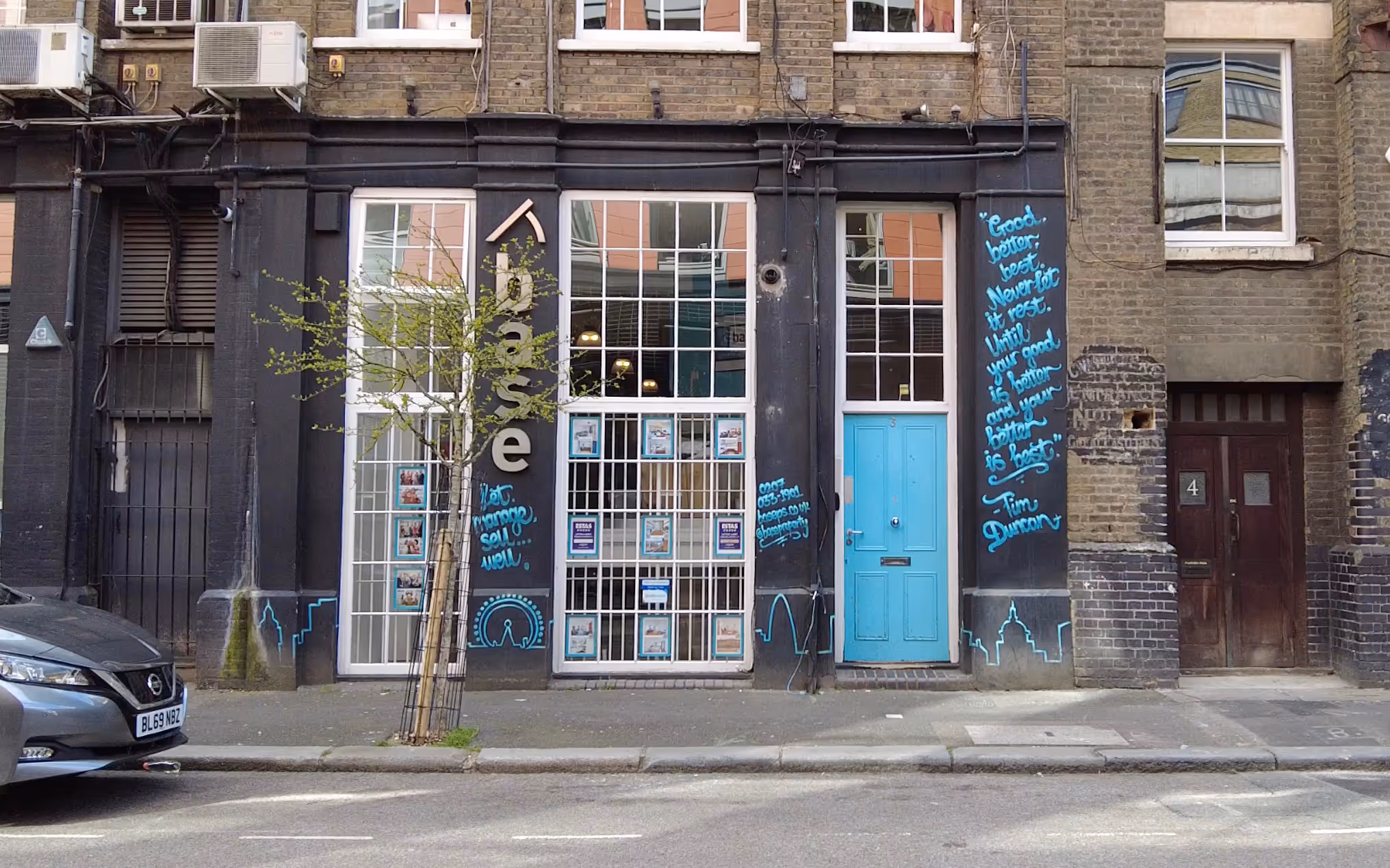
Up until this year, our most recent shop design has been a rather tasteful black frontage with a base blue line drawing of the London skyline along the bottom, and matching flowing handwritten information in between the windows, including a motivational quote attributed to legendary basketball player Tim Duncan (which may have been paraphrased from 4th century theologist St Jerome). This artwork was completed by street artist Tizer.
Then, in early 2022, it seemed like the right time to mark the next era for base with a refresh of our offices. To modernise our frontage, we had four designs drawn up for consideration. There were two things we wanted to keep in mind at the start of this process:
- Our heritage and surroundings. Shoreditch is one of the edgiest areas of London and boasts huge amounts of street art. Previous designs of the front have made use of graffiti art - we wanted to retain this feeling whilst presenting a clean and impactful image.
- Our branding. The use of base blue as our iconic colour was important as it features heavily on all of our branding - website, logo and even inside our own offices (co-founder An Deckers even wears base blue glasses!)
After settling on Option 1, we asked our long-time friend and handyman Kostas to bring the vision come to life, and what a transformation it is. The blue shop front shines in the sunlight and brightens gloomier days, and has the audacity to stand out amidst the art scene of Shoreditch - it has already been attracting a few photoshoots (influencers, we see you!).